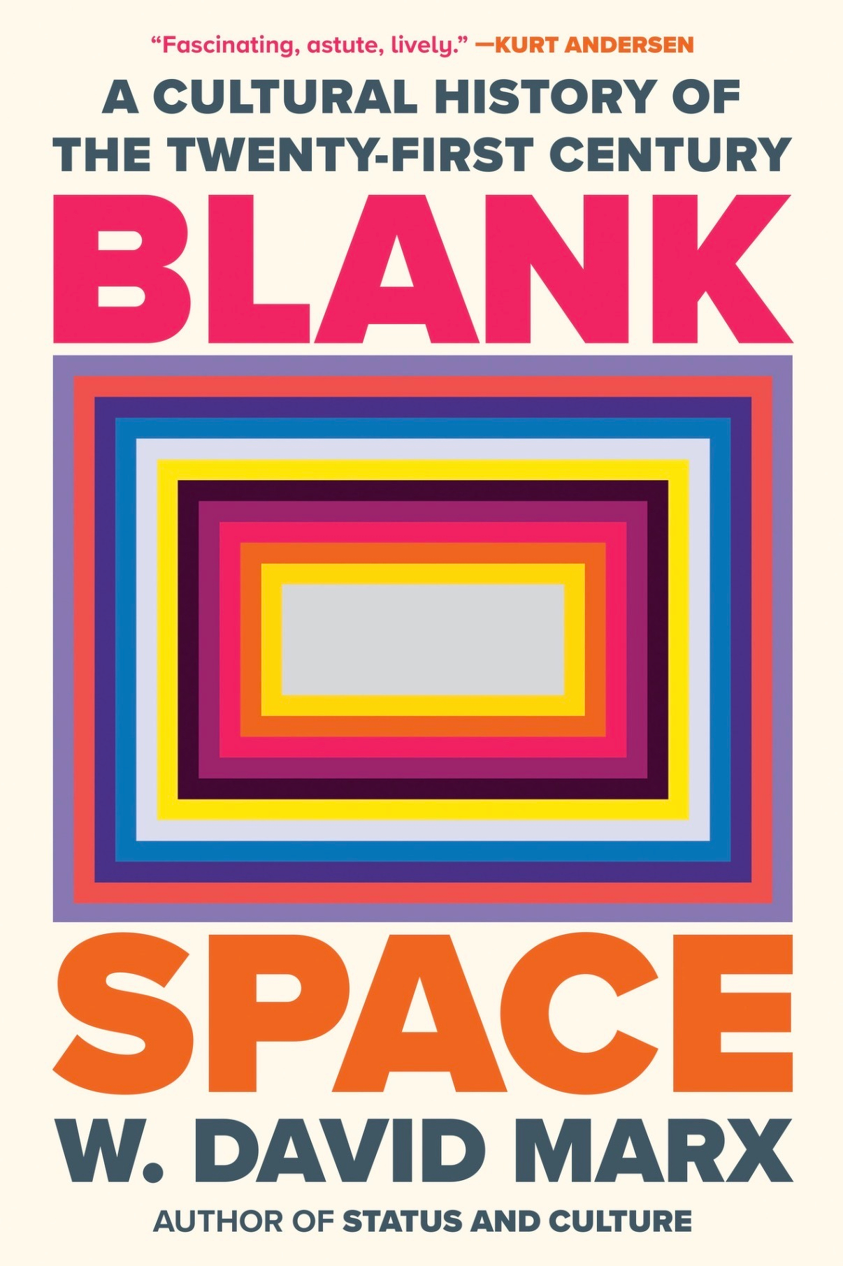
Book 13 of 100
A fantastic story that is a reminder that we all have at least a little bit of magic in us.
And sometimes the most faithful thing you can do—for your thinking, your creativity, your inner life—is to stop moving and let one idea finish its sentence.
You don’t need a new system.
You don’t need better inputs.
You don’t need to be more original.
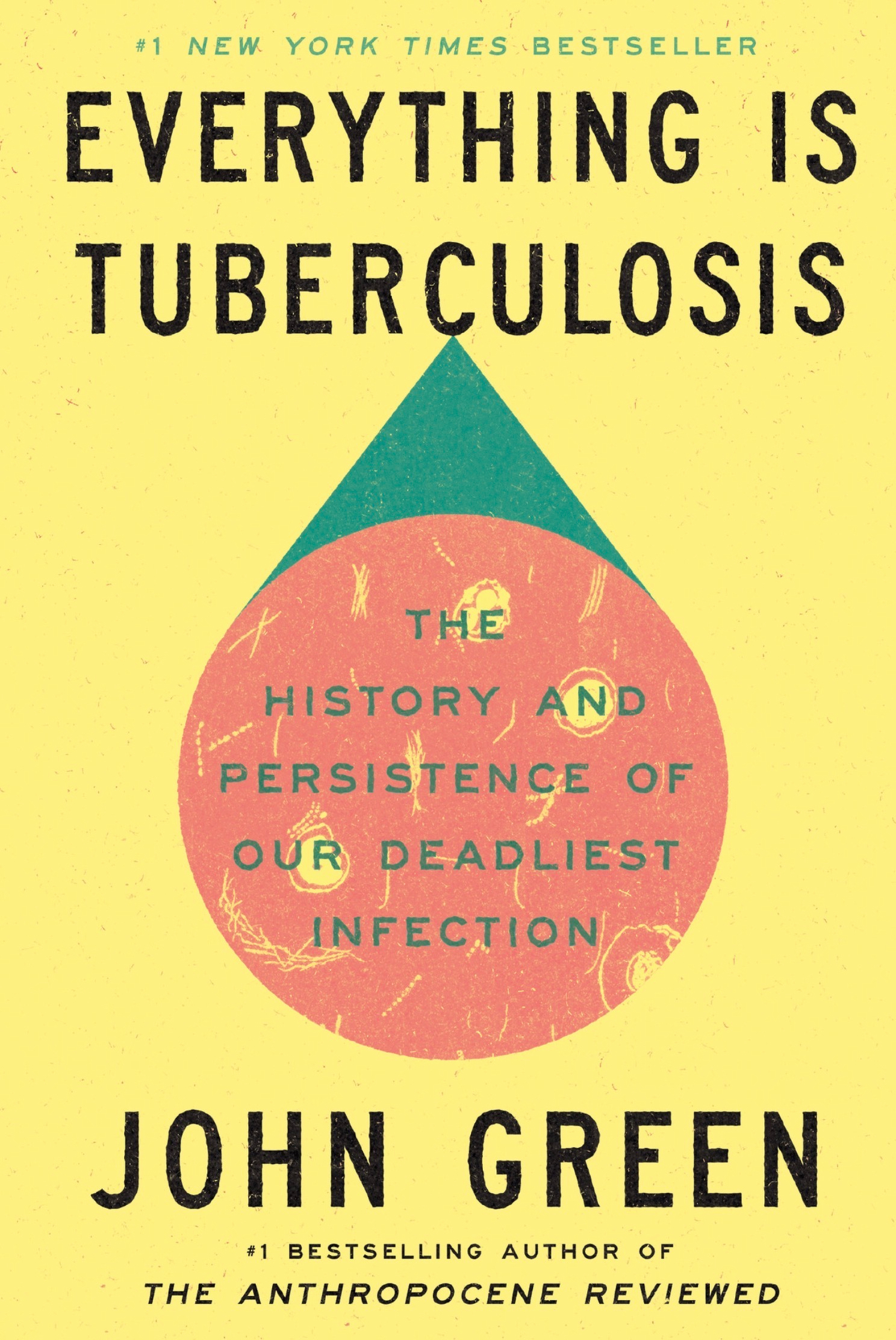
Book 12 of 100.
This one is really good, fairly short. A more somber and emotional take on the plot of the Groundhog Day movie.
Book 11 of 100.
A truly epic, both in length and story, tale of a Polynesian navigator that happens over a thousand years ago.
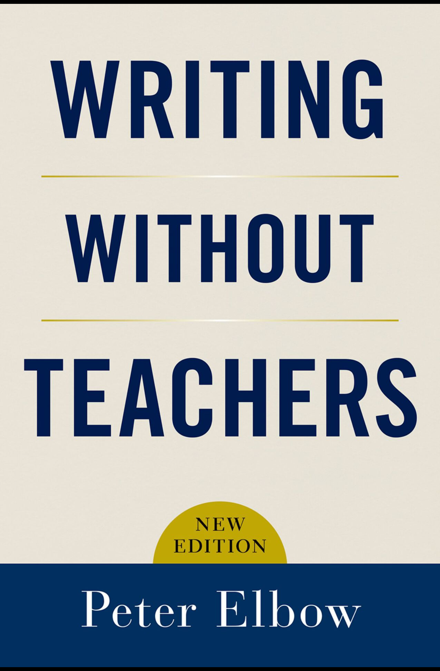
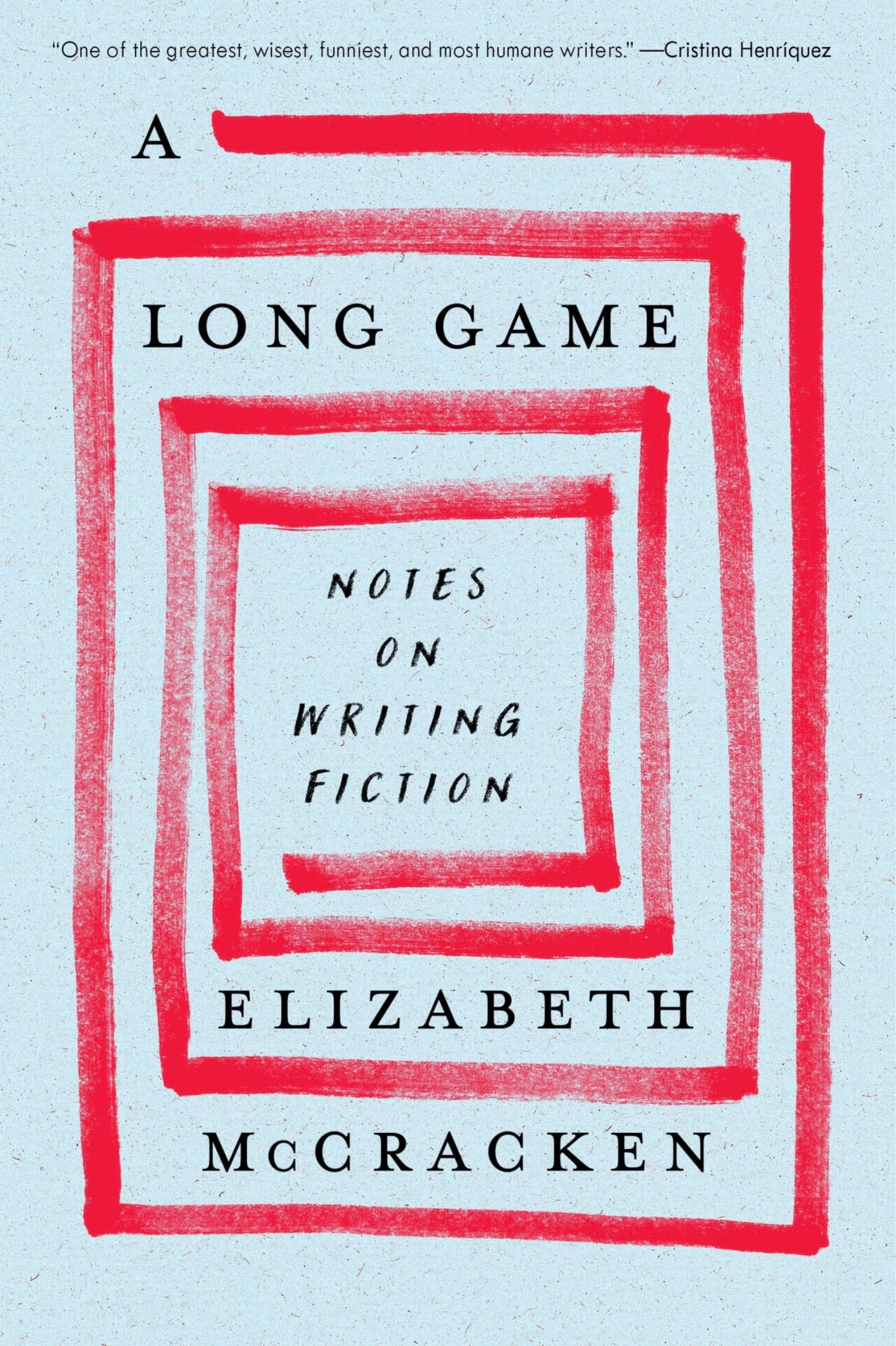
Book 10/100
This one had some really good stuff in it that I found useful. A main concept that I will utilize is “freewriting” which I am adding to my journaling routine.
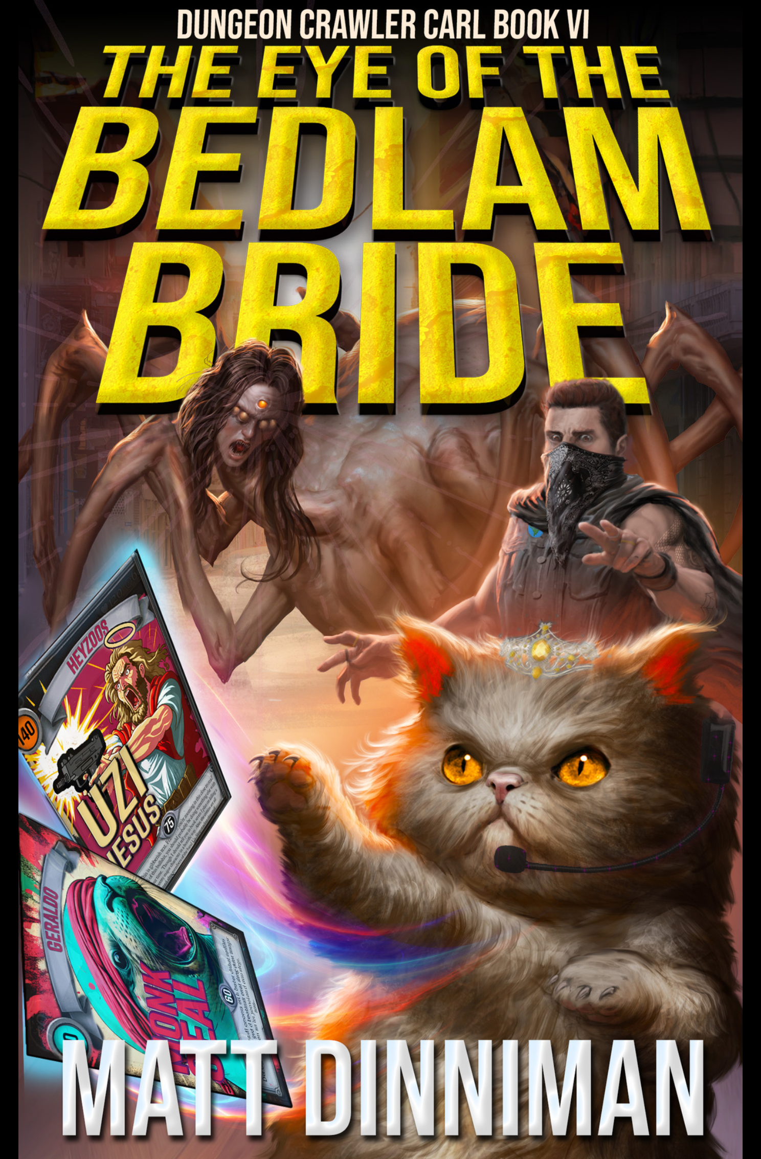
Book 9/100
These get more and more bonkers as we go. They are just what I need right now, and I’m a little sad I only have one left at the moment.
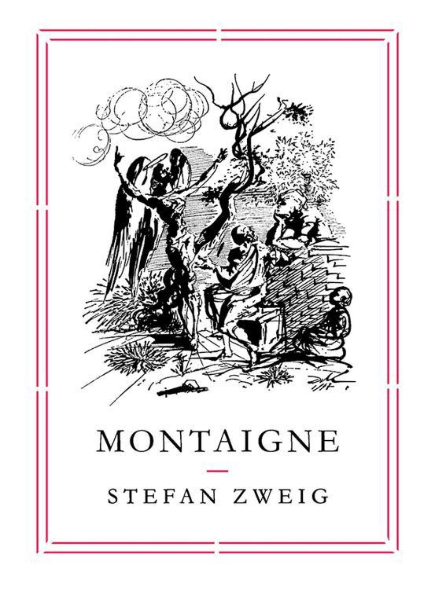
Book 8/100
A tiny bit dated but really enjoyable nonetheless.
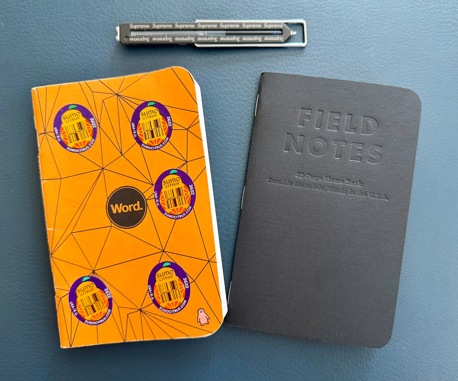
Out: Word Notebooks Orange Polygon
In: Field Notes Raven’s Wing (2010)
Book 6/100
I learned a lot reading this book, which says a lot given that I lived through all of this culture and change.
5/100
So well written, and moving. We can all do better, and should.
4/100
As worthwhile for readers as for writers, quite enjoyable.
3/100
A quick read about an admirable and intriguing person who had a very large influence on culture.
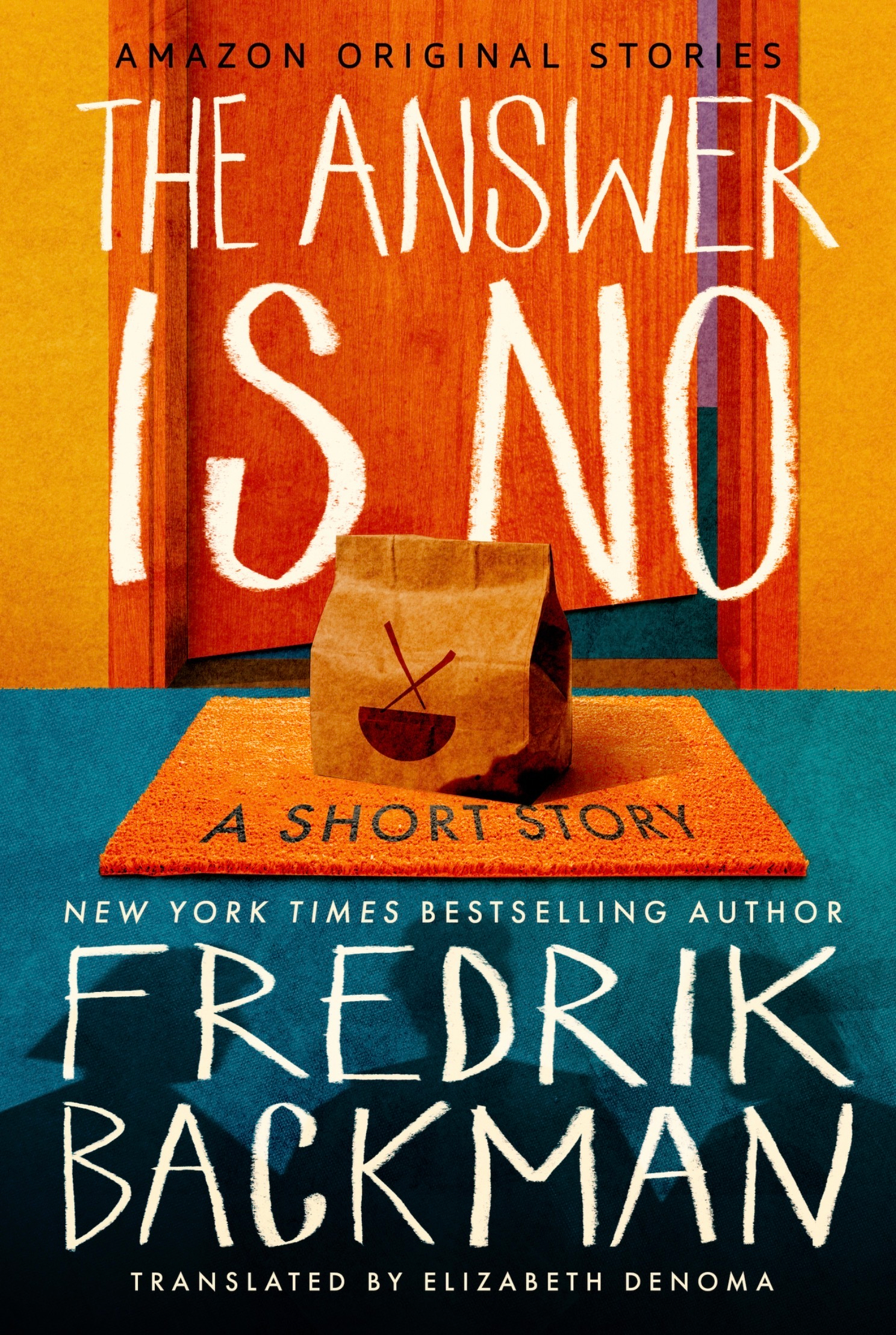
2/100 A short story/novella, a delight nonetheless.
The last few calm days before we go back to the craziness of regular routine.

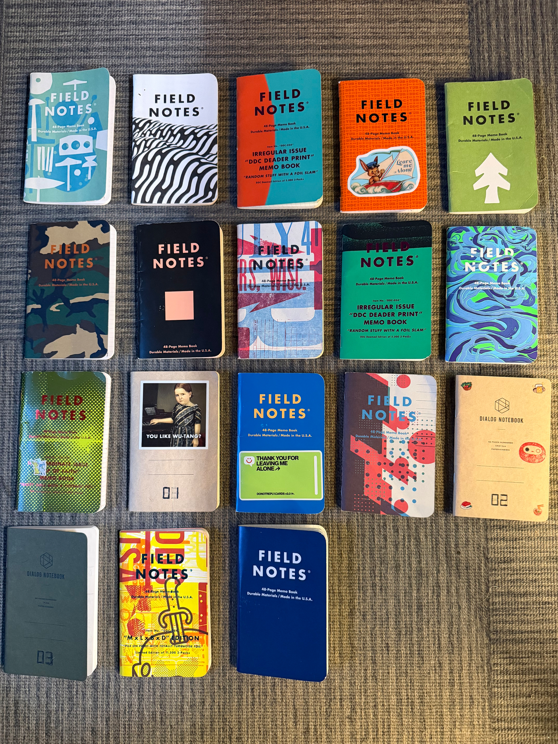
All the Pocket Notebooks I used in 2025.
1/100 Remarkably Bright Creatures by Shelby Van Pelt
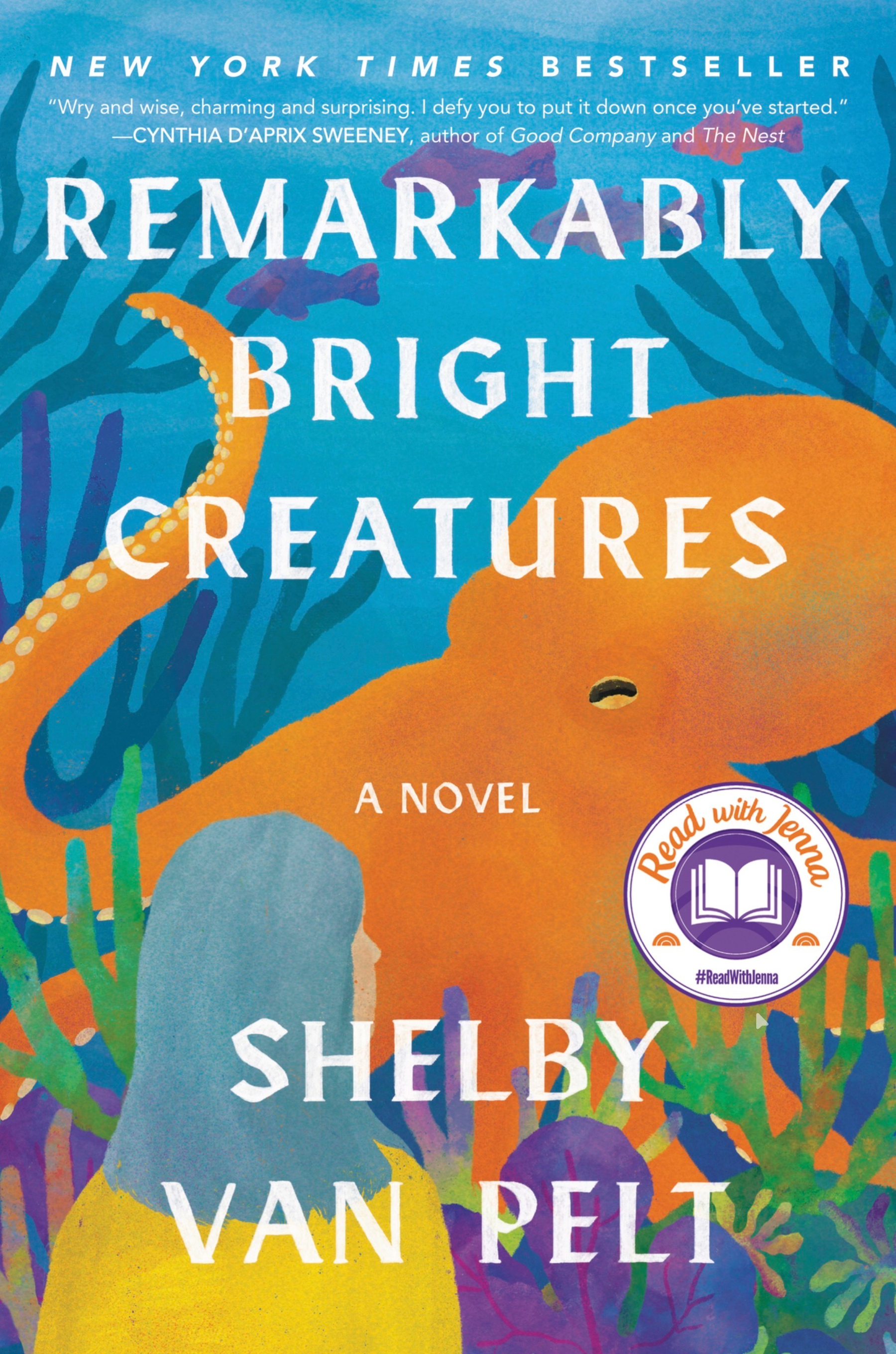
Borrowed through Libby. Quite enjoyable.
Current status

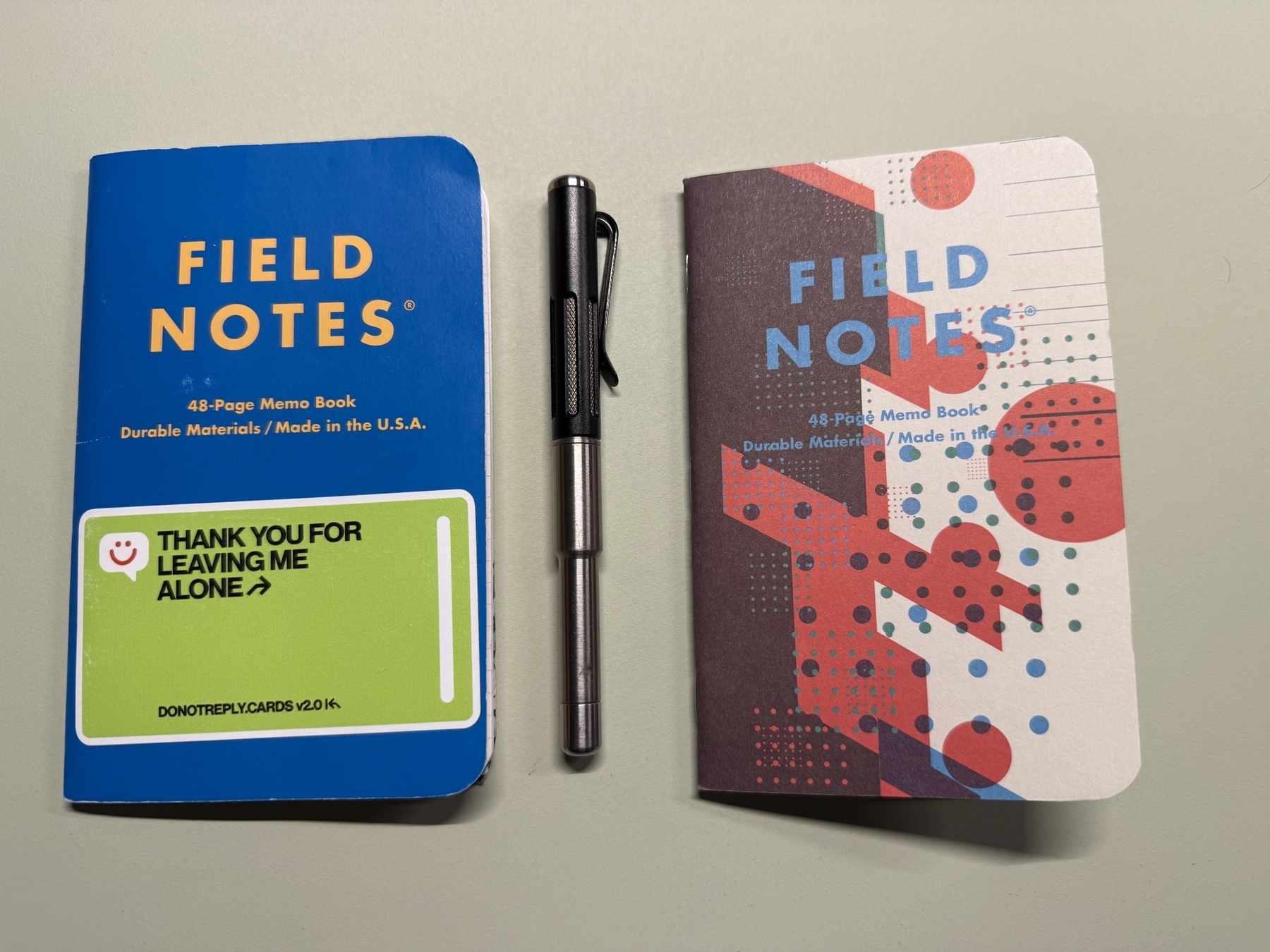
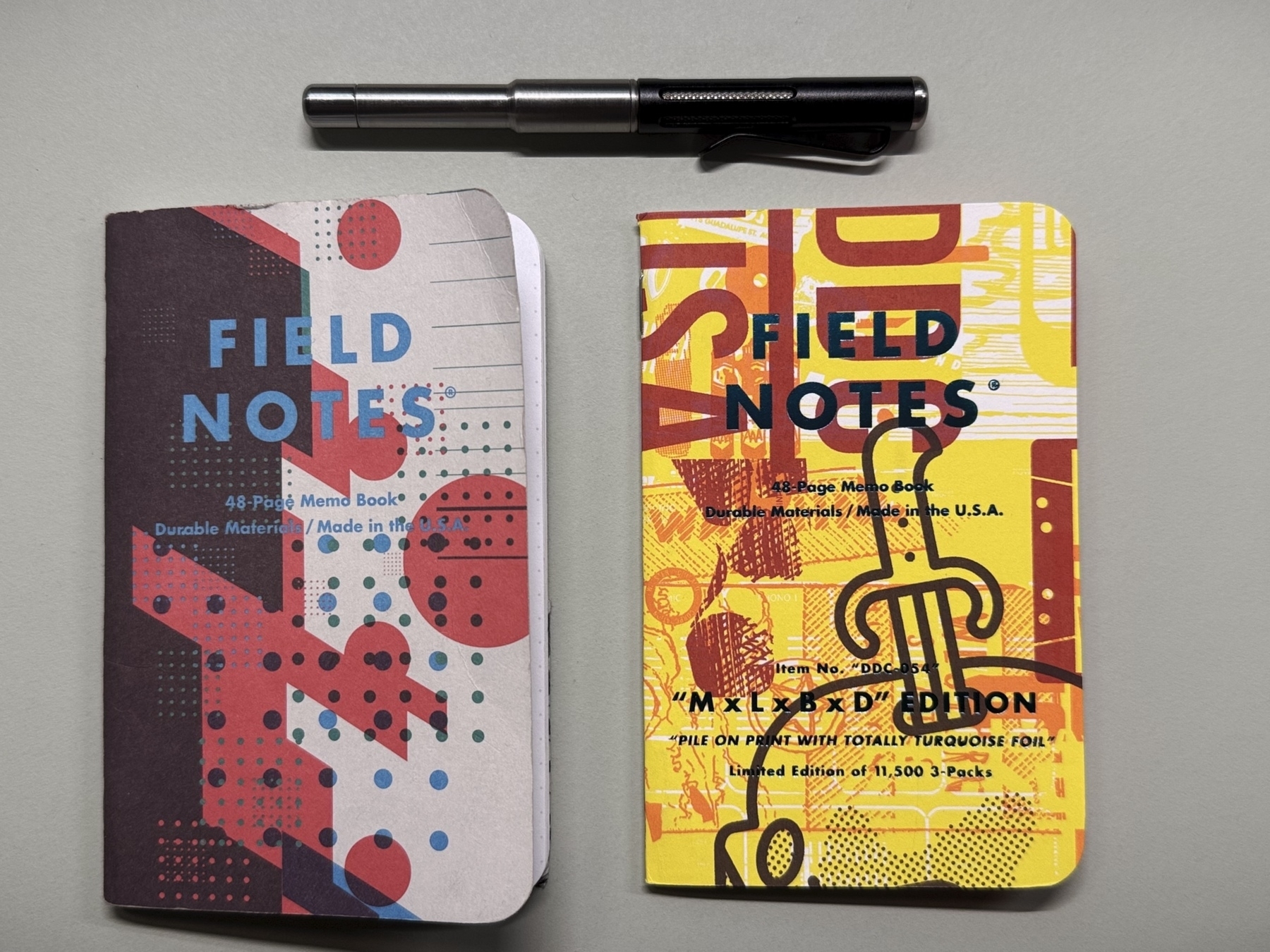
Out: Field Notes x Wilco Nels Cline & Lawrence Azerrad
In: DDC-054 M x L x B x D Edition (October 2017) (October 2017)
Out: Starbucks Reserve Coffee Origins Latin America
In: Field Notes x Wilco Nels Cline & Lawrence Azerrad